Anagrammatweest scoring changes (and new charts!)
In the previous post I describe a Node.js app I wrote to manually review pairs of tweets that form anagrams in order to retweet them to @anagrammatweest. Matches are created by a Java app I wrote that listens to a subset of the Twitter firehose. I’ve made some changes to the scoring methodology since that post and want to share the impact of these changes, along with updates to some of the charts from that previous post.
New Score Metrics
Manually reviewing anagram matches is a little annoying. I previously described the scoring methodology I came up with to try to determine if the anagram formed by two tweets is interesting enough to retweet. This scoring methodology at the time was based on an equally weighted score of three ratios using Damerau–Levenshtein edit distance, longest common substring length, and a count of the number of different words between the two tweets. I dubbed the combined score the interesting factor, meaning the two tweets in a high-scoring match are very different from each other and thus would probably be interesting enough to retweet. For every anagram I detected in the firehose, I would only save it for later review if its interesting factor met a minimum threshold.
For a while I thought that after reviewing enough anagrams, eventually I would build a large enough set of training data that I could begin to train machine learning models. With machine learning, I could successfully predict whether a given anagram is interesting or not. If the model is accurate enough, it could autonomously make the decision of whether to retweet an anagram to save me from manually reviewing it. The model could be trained on the label defined by whether or not I tried to retweet the match to @anagrammatweest. I could use individual scoring metrics such as Damerau–Levenshtein edit distance as features over which to train.
I went to a local Python meetup where I know there are regulars who are more experienced with machine learning than I am. I showed them my existing scoring methodology and they agreed that I had enough data to begin to tinker, but that I seriously needed to focus on engineering more features. They said this after I showed them a chart that basically looked like this:
The blue line shows the percentage of how many tweets for a given score I’ve retweeted. For example, for all of the tweets that score 0.95, the chart shows I was retweeting a little more than 20% of them at the time that screenshot was taken. This is a problem. To have any hope of training a model using scoring metrics as features, I need to engineer more features so that I’m retweeting much more than 20% of my highest scoring matches.
This led to me adding two additional metrics to use in the combined averaged score:
- The ratio of the number of English words in the two tweets to the total number of words in the two tweets.
- The ratio of the number of anagrammed characters for the match relative to the maximum possible tweet length, which a while ago I limited to 30 to save on space.
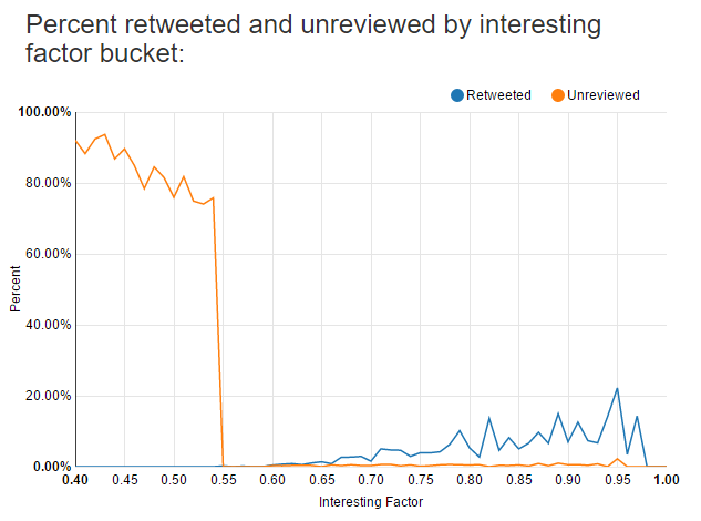
Here’s what that chart looks like now:
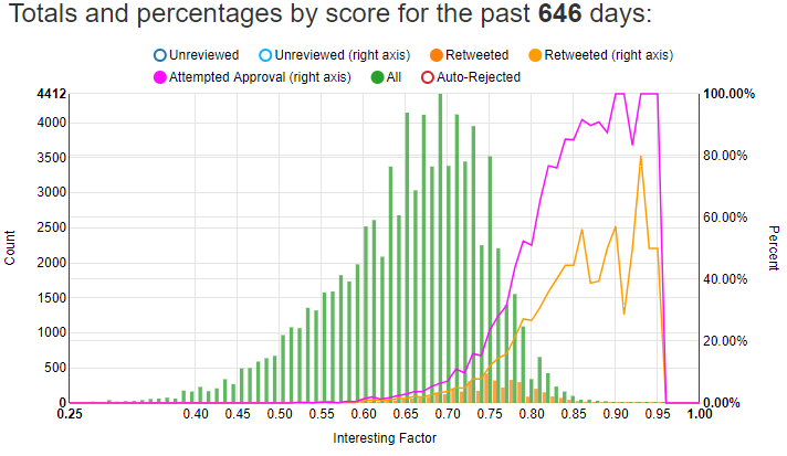
I also added in the totals as bars. Using the left Y-axis, you can see just how many total tweets I have for each score relative to the number I’ve retweeted. The orange line on this chart corresponds to the blue line on the previous chart. After adding these two metrics and reviewing more matches, I’m now mostly above 40% for high-scoring matches above 0.85 or so.
However, the orange line above only represents how many of those matches I’ve successfully retweeted. I try to retweet many matches, but for various reasons such as tweets being deleted or accounts being banned, I cannot successfully retweet both tweets in a match. Before I retweet a match, I check to see if I can still see both tweets. If I can’t still see both tweets then the match is automatically rejected. The purple line on the chart represents the percentage of matches I’ve attempted to retweet. At 0.85 and above I have about a 90% chance of retweeting the match. At 0.90 and higher I could probably automatically retweet the match and wouldn’t need to use machine learning at all. However, 0.90+ matches are rare as you can see from the height of the green bars; I see far more matches between 0.65 and 0.75 than above 0.85.
It’s annoying to find a good match, but then by the time I try to retweet it one of the two tweets has been deleted or is unavailable for whatever reason. I implemented a check that uses as much of my Twitter API rate limit as possible to check for the continued existence of tweets in my database. Every 15 minutes I check almost 900 tweets to see that they’re still there, and I delete from my database any tweets that I can no longer access. I hope that this will drop my approval failure rate over time, as more and more dead tweets are cleaned out. You can see the approval failure rate over time in this chart:
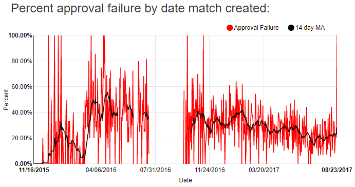
I added a 14-day moving average to smooth out the variability in the day to day number of approval failures. I hope the relative downward trend over the past few months continues.
After adding metrics to my combined score I also increased my minimum interesting factor threshold so that I would save fewer lower-scoring matches. You can see that change over time in this chart:
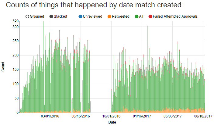
The green bars represent the total number of created matches for each day. The two highest bars on that chart are the Super Bowl. The days without bars are when I wasn’t running the app listening for matches.
Since my standards for matches have gone up, I’m creating fewer tweets each day even though I now have a significantly greater number of tweets in my database that I’m using to check for anagram matches. The change in my scoring criteria can be seen in this chart showing the average score for all created, approved, and rejected matches:
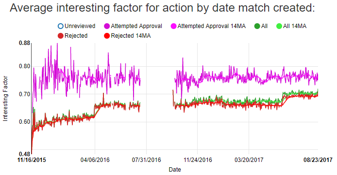
The bumps in April of 2016 and June of 2017 are when I made major changes to the scoring thresholds.
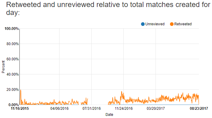
Overall, I’m looking at fewer matches and approving a higher fraction of matches that I create. However, I’m still retweeting a small fraction of the total number of matches I create:
Scoring Metric Efficacy
Surprisingly the total length metric worked out really well. It’s by far my most valuable metric to use when comparing two tweets. It makes me wonder if I should just use it alone instead of combining together several metrics. This chart shows the relative predictive power of each metric for approved matches:
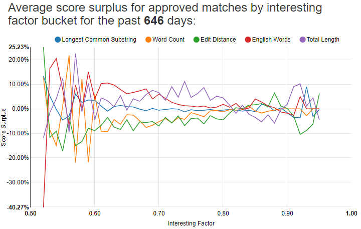
Notice Total Length in purple is the highest line for a good bit of that chart. For low-scoring matches, it tends to really matter that the tweets have English words in them. The chart is noisy below 0.60 and above 0.90 since there are so few approved matches with those scores.
These are the score surpluses for all approved matches above 0.50:
| Interesting factor | Longest common substring ratio | Word count difference ratio | Edit distance ratio | English word count ratio | Total length ratio |
|---|---|---|---|---|---|
| 0.093 | 0.102 | 0.081 | 0.067 | 0.093 | 0.124 |
Edit distance is surprisingly bad. I wonder if I should take it out. That’s a little ironic because I started this whole project with edit distance in mind, thinking it would be a fantastic way to determine if two anagrammed tweets are good to retweet.
Does Time of Day Matter?
At one point I wondered if the time of day might affect the quality of the matches I find. I charted how many matches I create and how many of those I approve for each 15 minute interval of the day, and then charted against it the average approval and rejected scores for that interval:
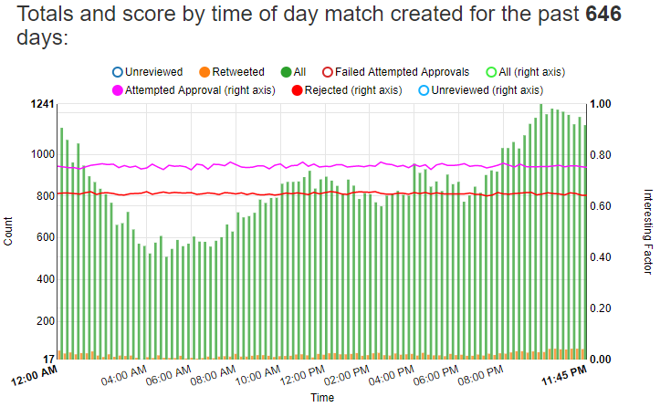
This chart was previously two separate charts shown in the previous post. I combined them into a single chart to make it easier to read.
The green and orange bars show that I generate more matches late in the evening around 11 PM and the fewest matches in the morning around 5 AM. However the purple line, representing the average interesting factor for all approved matches for the 15 minute interval for each of those bars, is pretty flat across the whole chart. It looks like the time the match is created doesn’t have a material effect on the quality of the match.
Number of Tweets Processed
As of the writing of this post I have 12,662,763 tweets in my database and 80,779 total matches. I’ve attempted to approve 7,742 of them.
A while ago I started keeping track of how many tweets I see relative to how many meet the filters to get saved to the database. This chart shows the disparity between the number of tweets I see relative to how many meet all the filters to get saved:
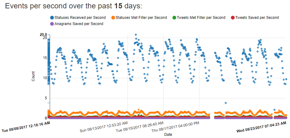
I save about 0.25 tweets a second, or in other words I save one tweet about every four seconds. Depending on the time of day I find about 5-10 anagrams an hour. I receive from Twitter about 15 tweets a second. Multiplying that out to the number of tweets I have saved, I estimate that I’ve processed somewhere around 700-800 million total tweets so far.
Follow me!
If you’ve made it to the end of this post, you should follow @anagrammatweest!